Transformative product clarity.
A clarity-first redesign for a craft tool that deserved a better introduction — video demonstration, a photography style guide, and a system the internal team could maintain. Built around the customers who needed it most.
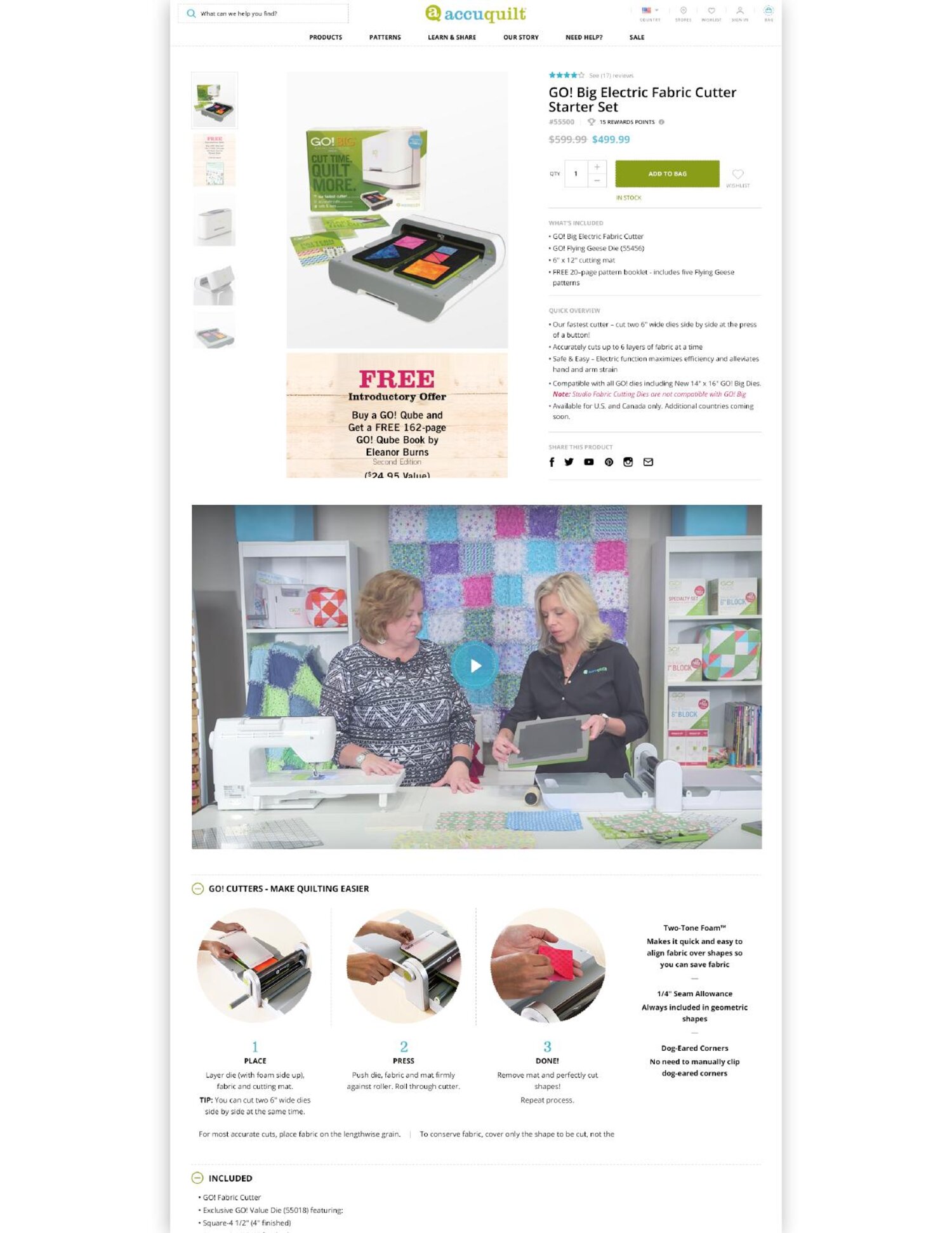
The full PDP — product imagery, an embedded video demonstrating the cutter in real use, and a clear three-step "Make Quilting Easier" sequence. Customers see what it does before they ever scroll to specs.
Visual comprehension at a glance.
AccuQuilt's cutters solved real problems for quilters — they made cutting fast, precise, and importantly, far easier on older hands tired of the repetitive motion that comes with the craft. The site needed to make that visible. Existing product photography didn't communicate what the cutters did, didn't distinguish one model from another, and didn't show the finished pieces customers were trying to make. A strong product needed a stronger story.
Internally, the team needed a system they could keep updating themselves — not another redesign that would feel out of date in a year.
Sell the clarity. Then design it.
I led discovery, sold the engagement, and shaped the deliverables around a single question: could a customer understand the product in five seconds? The answer was a clarity-first system with three pillars:
Video demonstration embedded on every PDP so the cutter could show its own value. A photography style guide built for the AccuQuilt internal team — with real examples comparing weak photography (product on white, no context) against the new standard (cutters in use, finished pieces alongside, environments that show scale and process). A reusable content system so the team could keep representing new SKUs the same way the redesigned ones were, without needing to commission an agency every season.
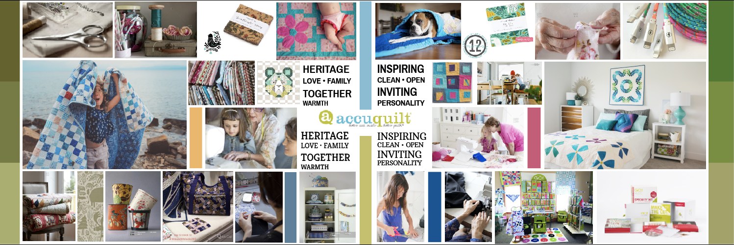
Brand moodboard — pairing the heritage of quilting with a clean, inspiring, modern voice. The reference that grounded every downstream decision.
What I led.
- Sold the EngagementIdentified the clarity gap, made the strategic case for video and a photography system, and won the work as part of my growth-team role.
- Creative DirectionCreative directed the entire site redesign — from system architecture to PDP detail — partnering with the AccuQuilt internal team to bring the new direction to market.
- Product-Clarity StrategyReframed how the cutter was represented — video, contextual photography, and side-by-side examples that show difference between models and finished output.
- Photography Style GuideBuilt a practical guide the AccuQuilt team could follow on every future shoot — with rejected vs. approved examples, lighting and composition standards, and product-staging principles. The guide also gave the internal team a clear shot list for upcoming photoshoots, including the exact aspect ratios required for each module across the site.
- PDP RedesignNew product page layout integrating the video, redesigned imagery, specs, and use cases.
- Internal ToolkitA reusable system that made it easy for the internal team to keep the site current as new products and patterns ship.
- Brand Narrative LayerBeneath the clarity work, an emotional storytelling layer connecting quilting to family, heritage, and the people it serves — including the older quilters the product was built to support.
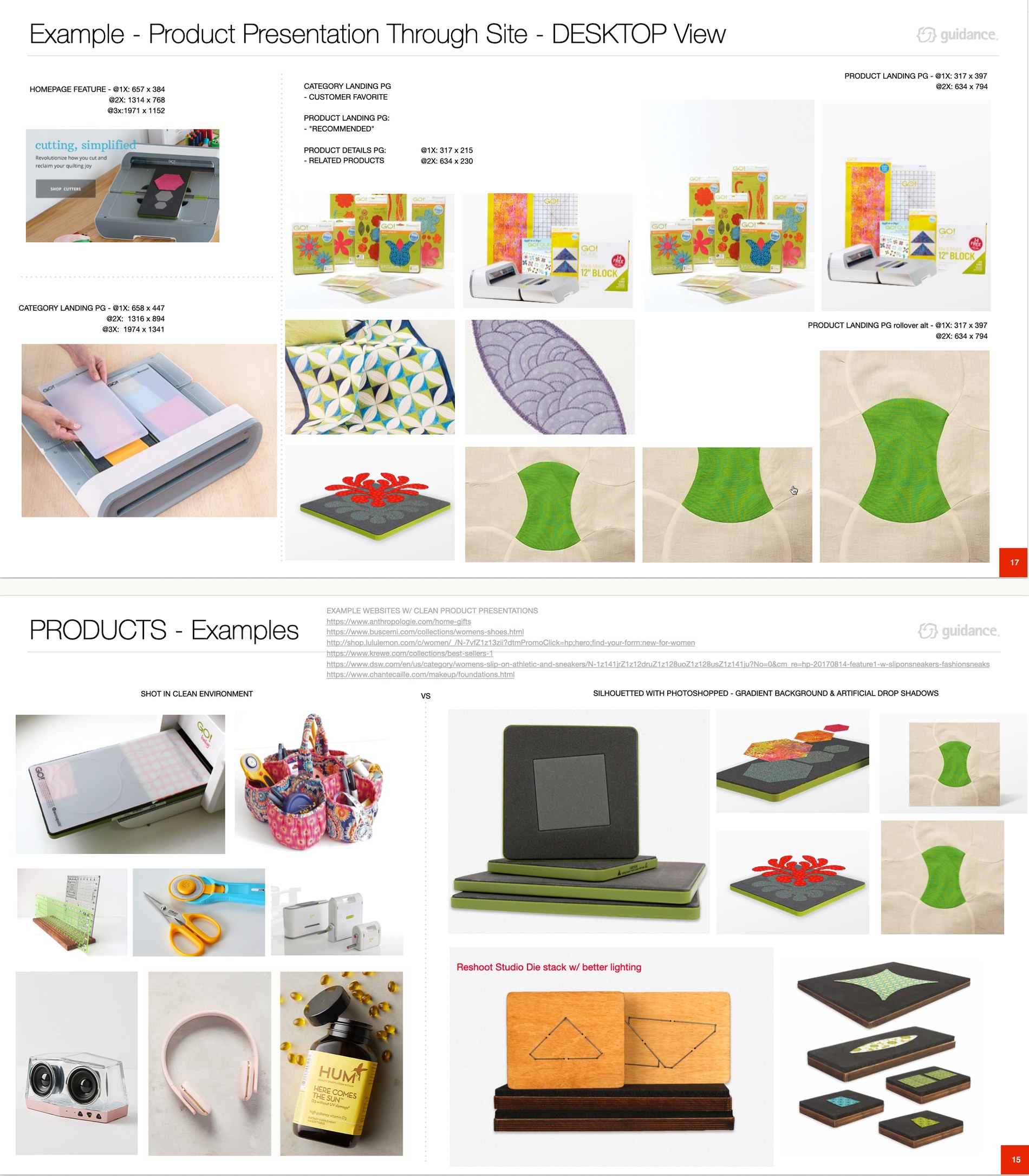
Pages from the photography style guide — approved staging shown alongside the older treatments to replace. A practical reference the AccuQuilt team can apply on every shoot.

The emotional layer — the finished piece, the maker, and the moment the work creates. The product is the enabler, not the headline.
A product customers could finally see — and a team that could keep it that way.
- Product ClarityThe cutter's value — speed, precision, and relief for older hands — became readable at a glance. No more guessing.
- Differentiation Across the LineCustomers could finally tell the difference between cutter models and see the finished pieces each enabled.
- Operational IndependenceThe photography guide and content system let AccuQuilt's internal team maintain consistency without re-engaging an agency for every new SKU.
- Brand ResonanceBeneath the clarity work, an emotional thread that positioned AccuQuilt alongside the heritage craft brands quilters already loved.