Conversion through UX strategy.
Reframing a legacy brand around what gets made — and the people who make it. A modern lifestyle destination, built on a unified content and commerce system.
Revamped global navigation — reorganized categories with a unified UX/UI system that bridges content and commerce.
A legacy brand whose digital experience hadn't kept up.
King Arthur needed to evolve from a transactional flour company into a modern lifestyle destination. The digital experience felt dated and narrow. Content and shopping lived in separate worlds, and the navigation didn't help shoppers — the categories were labeled in marketing language like "Categories" and "Favorite Flavors," which meant nothing to someone trying to find flour. We restructured around what shoppers actually look for: "Flours," "Ingredients," "Mixes," "Gluten-Free," and so on — language that matched intent and made the catalog navigable.
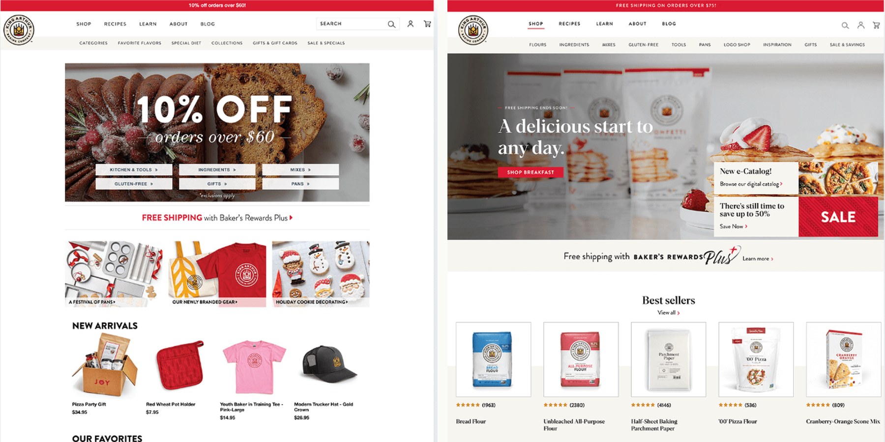
From a dense, promotion-led, product-first homepage to a clean, modern editorial experience centered on the bakes.
Reframe the brand around the bake, not the bag.
I shifted the visual and information strategy from product-first to human-centric. Where the old site led with bags of flour, the new experience leads with what the flour makes — the bread, the cookies, the pies — and the bakers who make them. We used cleaner, better-cropped product photography still on a white background, with product cards using a hover state to reveal the recipe outcome underneath. The product was still the product; the bake was the reason to buy it.
Customer interviews also surfaced a clear blocker to purchase: paying for shipping. So we surfaced the Baker's Reward Plus free-shipping program right on the homepage, directly under the hero, where every visitor would see it.
To make the site feel cohesive, I reorganized the categories and revamped the global navigation end-to-end — both UX and UI — so content and commerce stopped feeling like separate destinations and started reinforcing each other. The visual system was modernized to match the brand's category leadership, and the team got a modular design system built for scalability — easy to extend, easy to edit, fast to ship from.
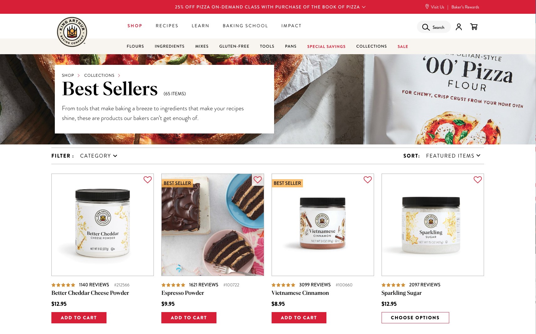
Product cards with a hover state — instead of just the package, customers see the bake. Product becomes outcome.
What I led.
- Information Architecture & Global NavigationReorganized the catalog and rebuilt the global nav — UX and UI together — replacing vague labels ("Categories," "Favorite Flavors") with shopper-intent language ("Flours," "Ingredients," "Mixes," "Gluten-Free") so customers could move between content, recipes, and shop without friction.
- Visual ModernizationA modern design overhaul replacing dated, promotion-led layouts with a clean editorial system that matches the brand's category leadership.
- Product-Outcome PhotographyCleaner, better-cropped product photography still on a white background — with product cards using a hover state to reveal the recipe outcome underneath. Product became outcome without losing utility.
- Free-Shipping SurfacingCustomer interviews flagged shipping cost as a key blocker, so we placed the Baker's Reward Plus free-shipping program directly under the hero on the homepage — removing the friction point at the entry to the funnel.
- Representation & DiversityCustomer research surfaced that male bakers felt under-represented across the site. We rebuilt photography and storytelling casting to reflect the actual range of King Arthur's bakers.
- Modular Design SystemBuilt a modular component-based design system that gave the team scalability and made site edits and new launches fast — a foundation the team could extend without re-engaging an agency.
- Content + Commerce IntegrationBridged two previously segregated worlds — recipes feed products, products ground recipes — into a single cohesive journey.
A cohesive, modern destination — and a measurable lift.
- Brand TransformationReframed identity from transactional flour catalog into a modern lifestyle destination for bakers.
- Unified SystemContent and commerce now operate as one experience — a foundation the team can extend as the brand grows.